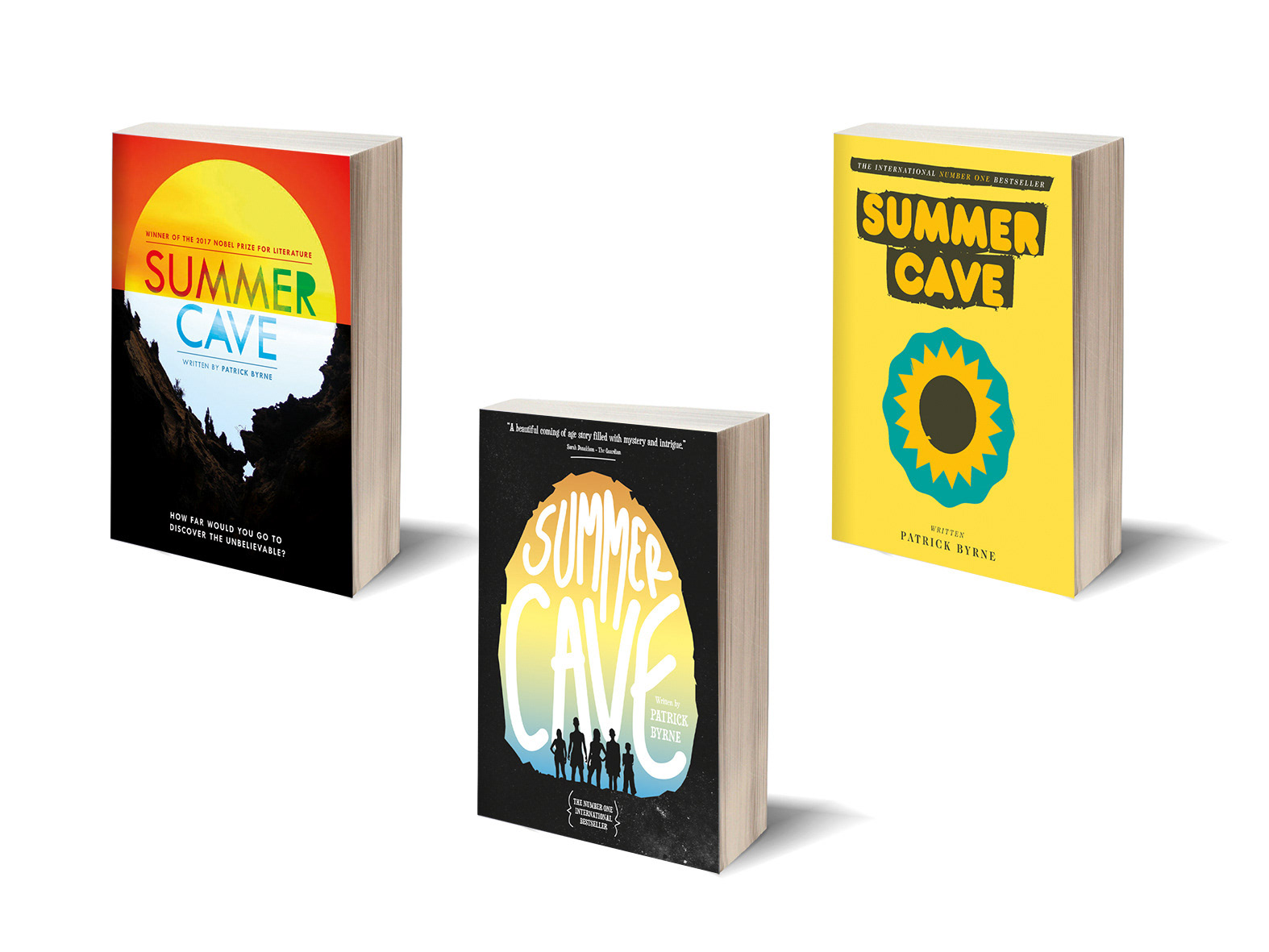
Client Diploma project | Project Book covers
This was another submission for my Diploma course. The brief was to re-design 3 book covers already in existence. I chose Lord of the Flies, Sleepers and Trainspotting.
They had to fall into 3 categories; Graphic Translation (Trainspotting), Photography and Semiology (Sleepers) and Illustration or Painting (lord of the Flies).
They had to fall into 3 categories; Graphic Translation (Trainspotting), Photography and Semiology (Sleepers) and Illustration or Painting (lord of the Flies).
This project was featured at the time by Creativepool on their homepage.
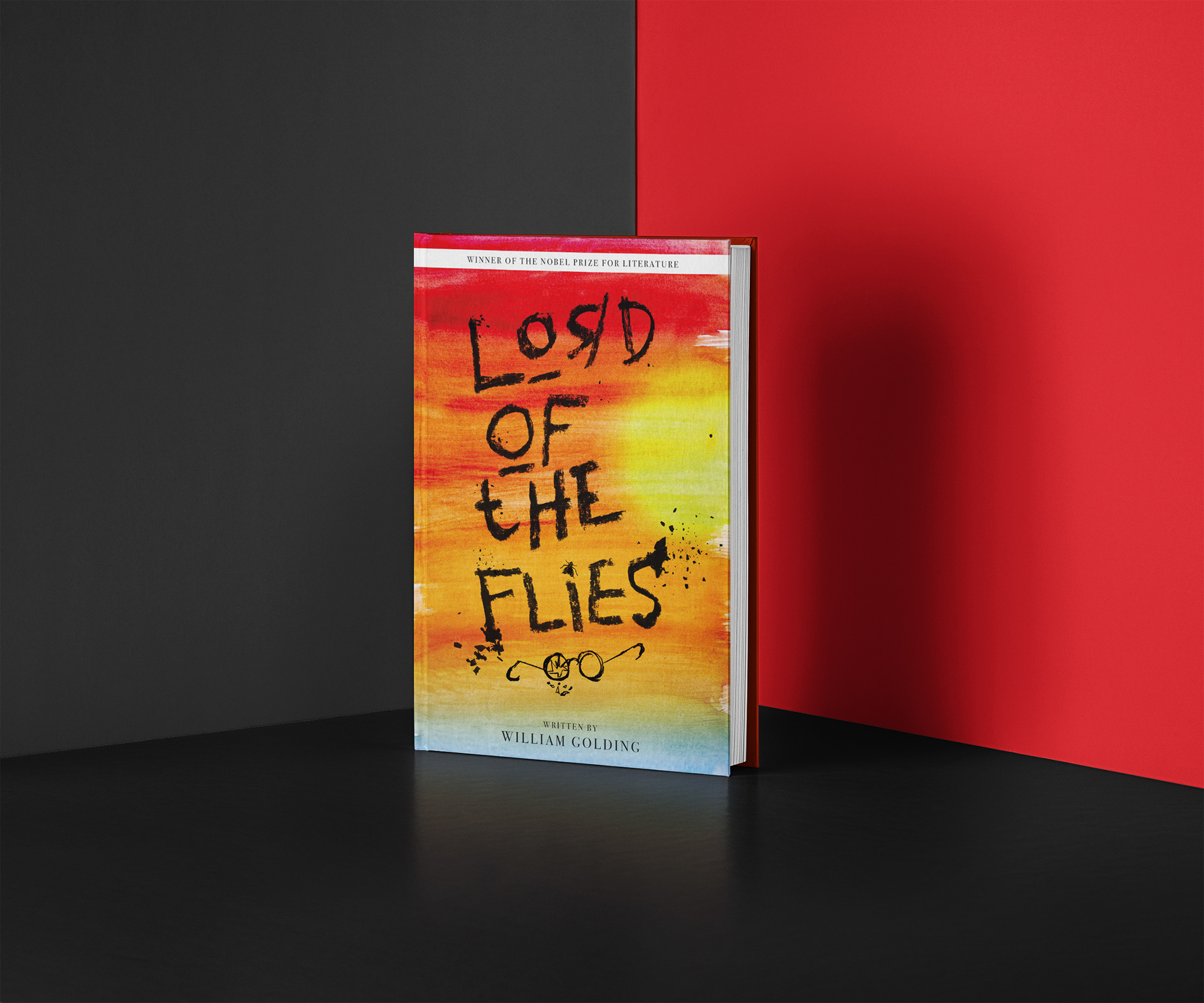
LORD OF THE FLIES
The background was to represent an abstract view from an island with sea and setting sky. I hand drew the black text and images with a charcoal pencil which was scanned and overlaid. Underlined ‘o’ are to reflect the aggressive under eye marks and backwards ‘R’ to lean to the fact they are children.
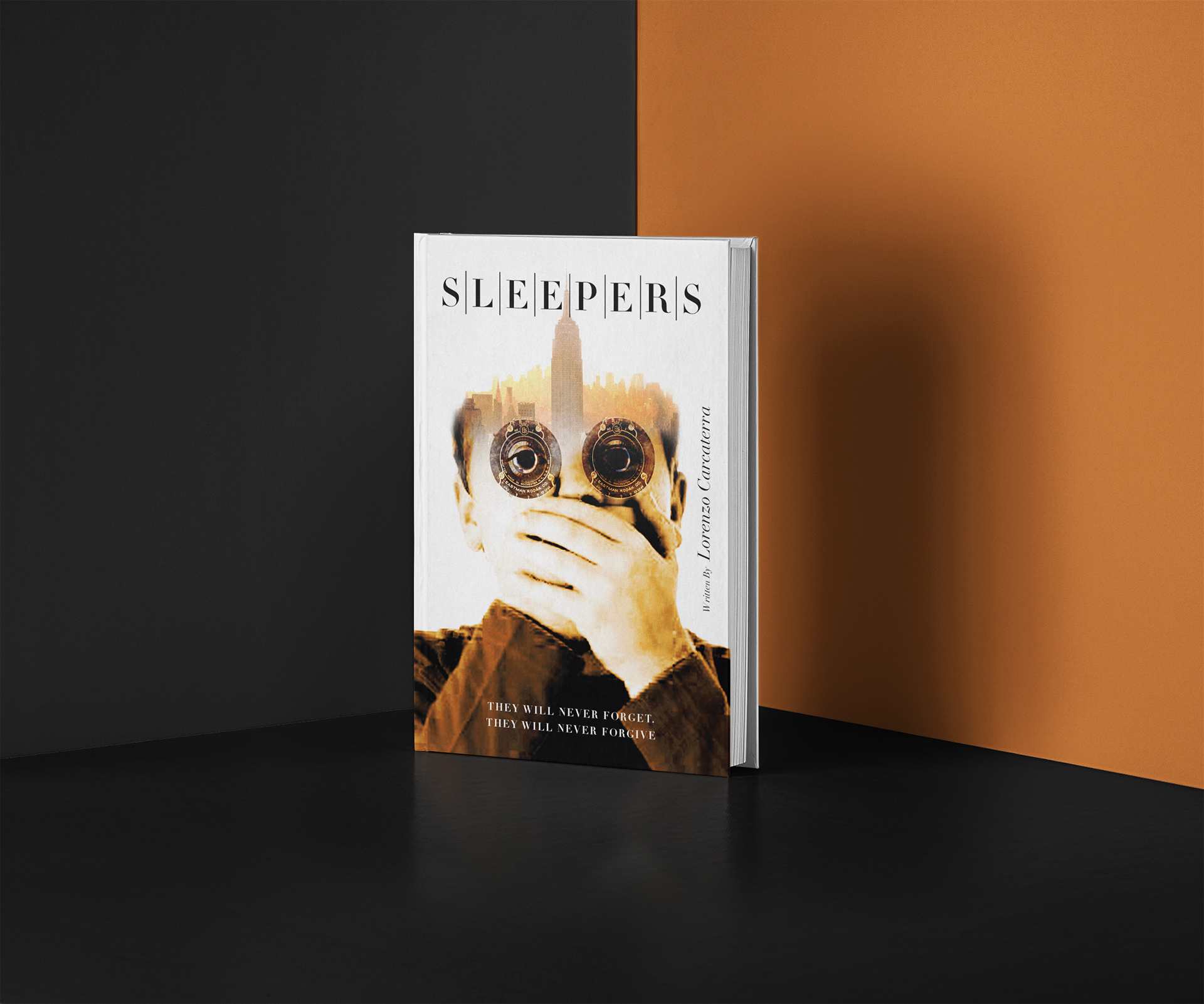
SLEEPERS
The picture of the boy with his hands over his mouth represents the secrets of the
abuse that went on in the boys prison. I combined it with an image of a New York skyline as that’s where they lived and added warm colours as the events were during a very
hot summer.
abuse that went on in the boys prison. I combined it with an image of a New York skyline as that’s where they lived and added warm colours as the events were during a very
hot summer.
The vintage camera shutters over the eyes echos the fact that they will never be able to forget, and the dividing lines between each letter of the title represents prison bars.
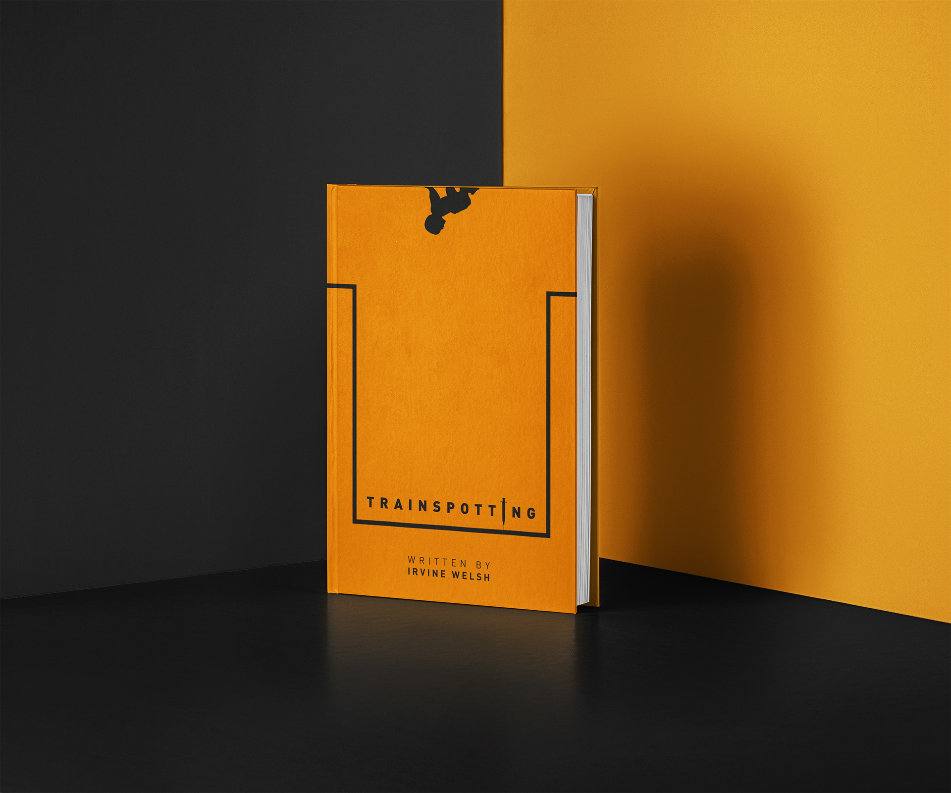
TRAINSPOTTING
The orange colour was taken from the posters at the time. The image of the baby a the top with it’s head on the wrong way round is a fleeting but visceral part in the story. I dropped the title down to represent falling and it’s also in the shape of a ‘T’.
A syringe also replaces the ‘I’ in the title.