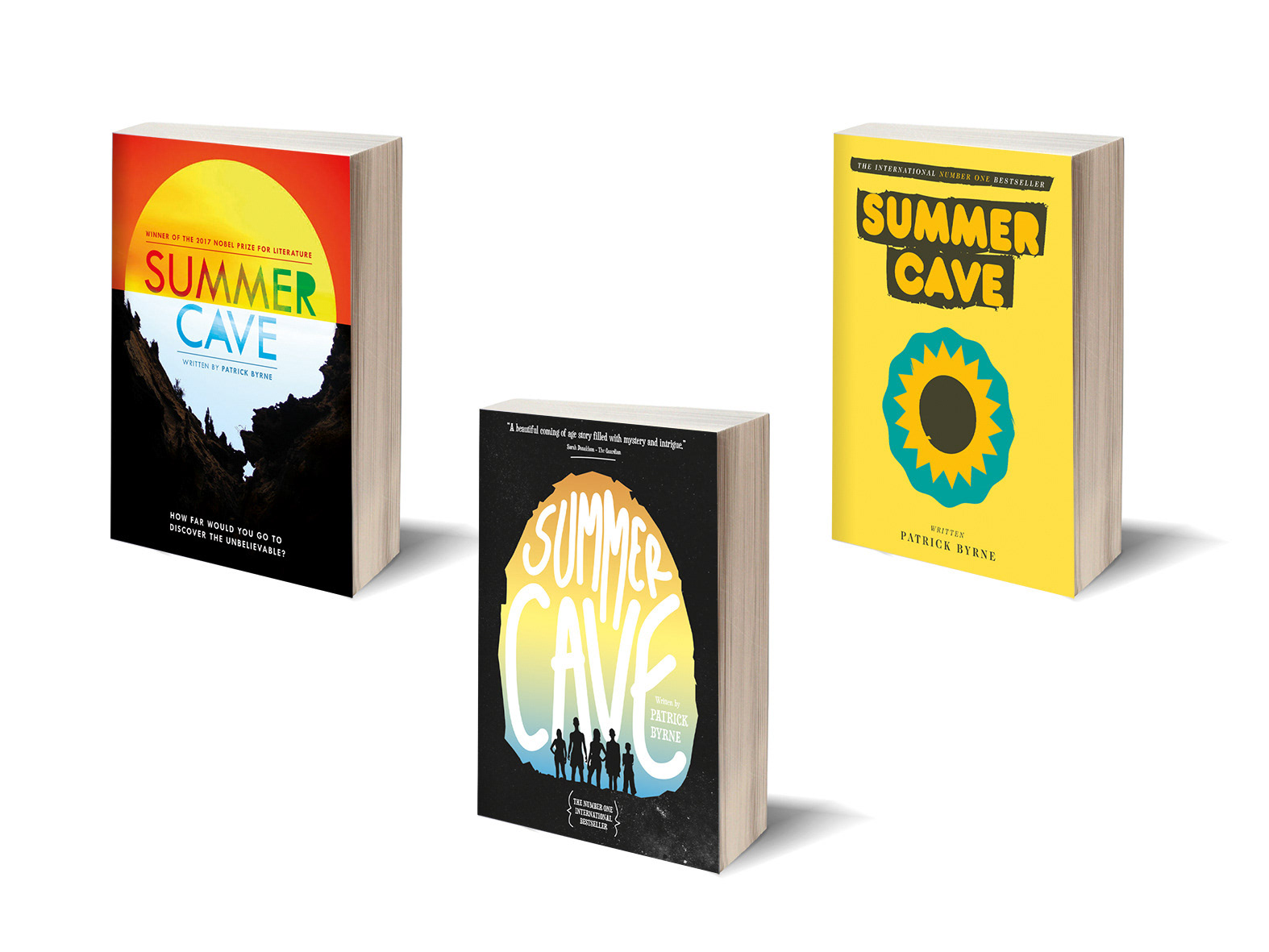
Client Diploma project | Project 'Shennong Tea' Packaging
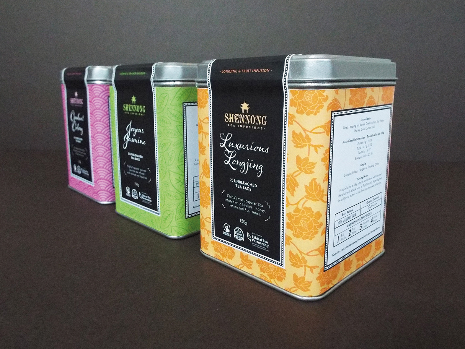
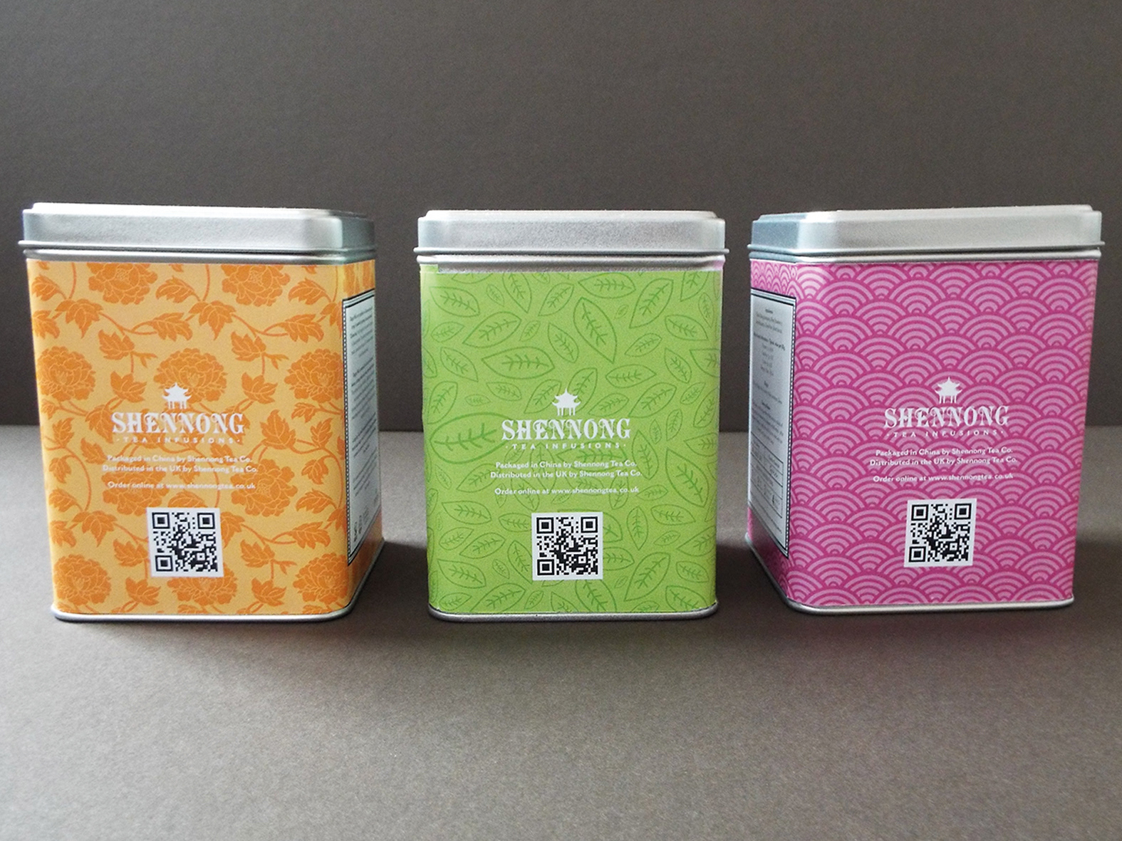
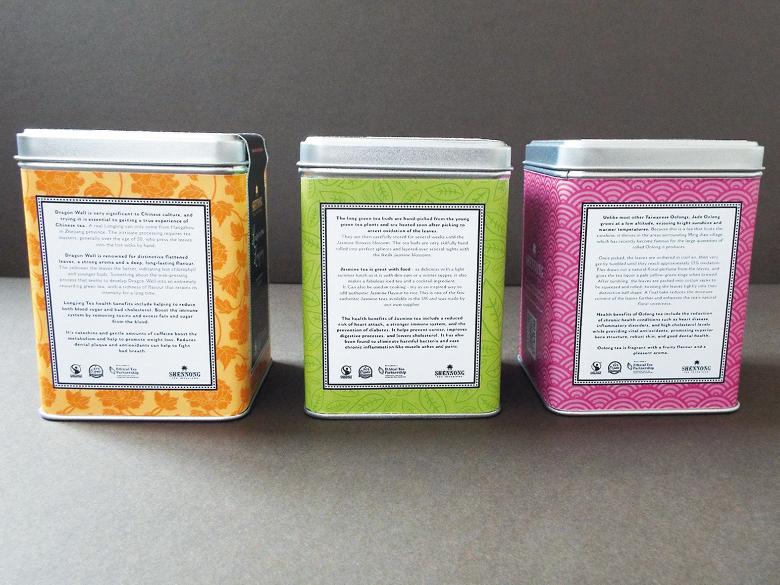
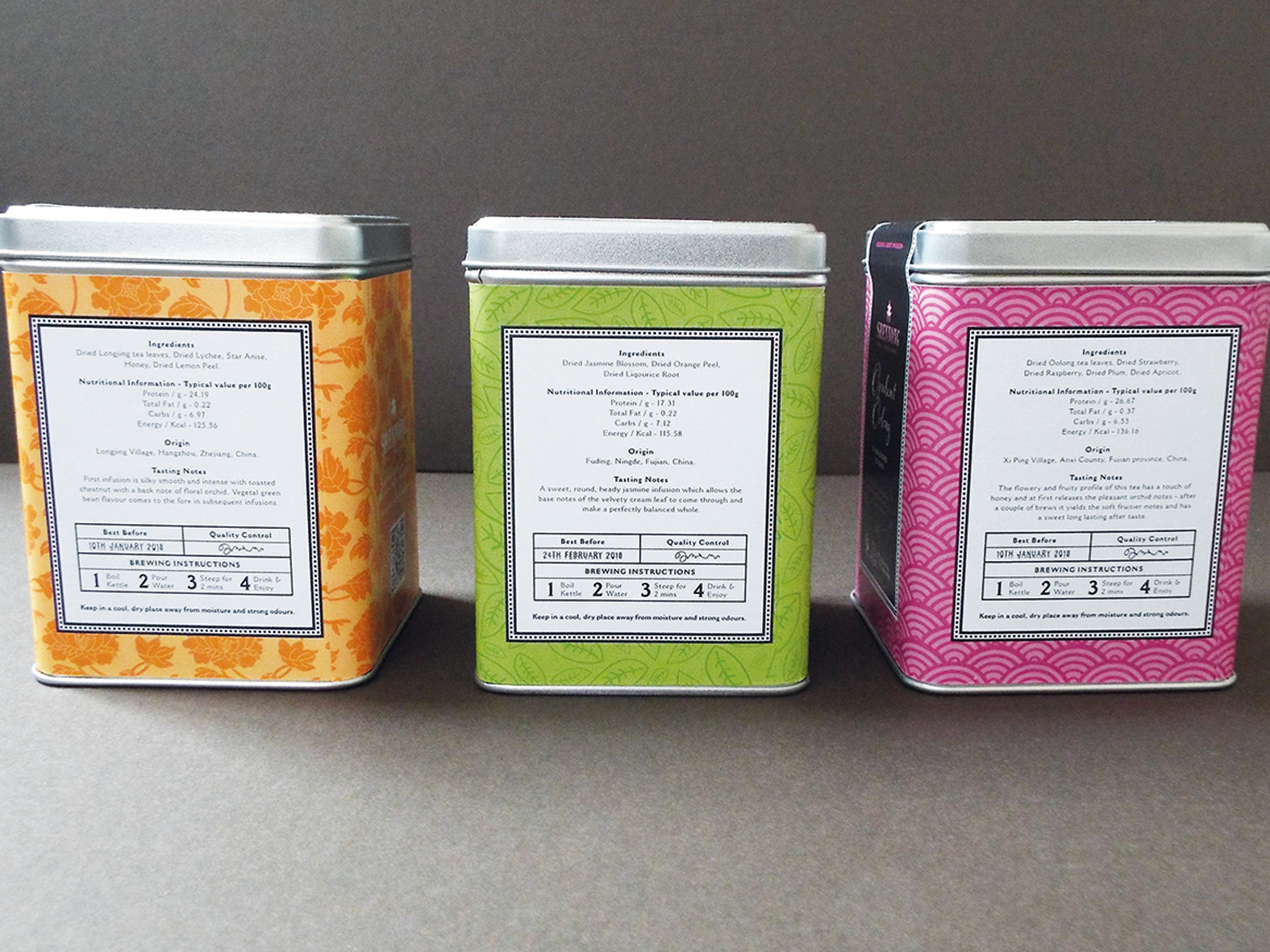
I had to design the surface graphics for 3 herbal teas. The brief was to design consistent branding for all 3 containers. They would be aimed predominantly at women who are 25+ and health conscious. We also had to consider how they would look on a retail shelf with other packaging.
The logo was based on the name of the original discoverer of tea – Emporer Shennong from China, so I decided the contents of the packaging would be the 3 most popular Chinese teas.
I kept the style and colours quite feminine. The colours would all work together on a retail shelf but also independently. It also allows for future flavours to be developed and would lend itself to colour and image adaptions.